Matplotlib 散点图
创建散点图
使用 Pyplot,您可以调用 scatter() 函数来绘制散点图。
scatter() 函数为每个观测值绘制一个点。它需要两个长度相同的数组,一个用于 x 轴的值,另一个用于 y 轴的值。
示例
简单的散点图
import matplotlib.pyplot as plt
import numpy as np
x = np.array([5,7,8,7,2,17,2,9,4,11,12,9,6])
y = np.array([99,86,87,88,111,86,103,87,94,78,77,85,86])
plt.scatter(x, y)
plt.show()
结果
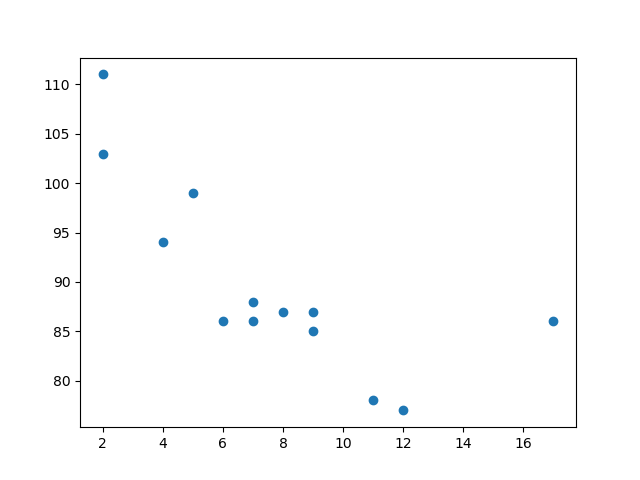
上面的示例中的观测值是 13 辆汽车经过的结果。
X 轴显示汽车的年龄。
Y 轴显示汽车经过时的速度。
观测值之间是否存在任何关系?
似乎汽车越新,开得越快,但这可能只是巧合,毕竟我们只记录了 13 辆汽车。
比较绘图
在上面的示例中,速度和年龄之间似乎存在关系,但如果我们绘制另一天的观测值呢?散点图是否会告诉我们其他信息?
示例
在同一图中绘制两个图
import matplotlib.pyplot as plt
import numpy as np
# 第一天,13 辆汽车的年龄和速度
x = np.array([5,7,8,7,2,17,2,9,4,11,12,9,6])
y = np.array([99,86,87,88,111,86,103,87,94,78,77,85,86])
plt.scatter(x, y)
# 第二天,15 辆汽车的年龄和速度
x = np.array([2,2,8,1,15,8,12,9,7,3,11,4,7,14,12])
y = np.array([100,105,84,105,90,99,90,95,94,100,79,112,91,80,85])
plt.scatter(x, y)
plt.show()
结果
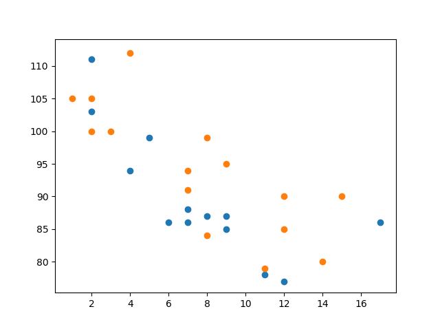
注意:这两个图以两种不同的颜色绘制,默认是蓝色和橙色。您将在本章后面学习如何更改颜色。
通过比较这两个图,我认为可以安全地说它们都得出了相同的结论:汽车越新,开得越快。
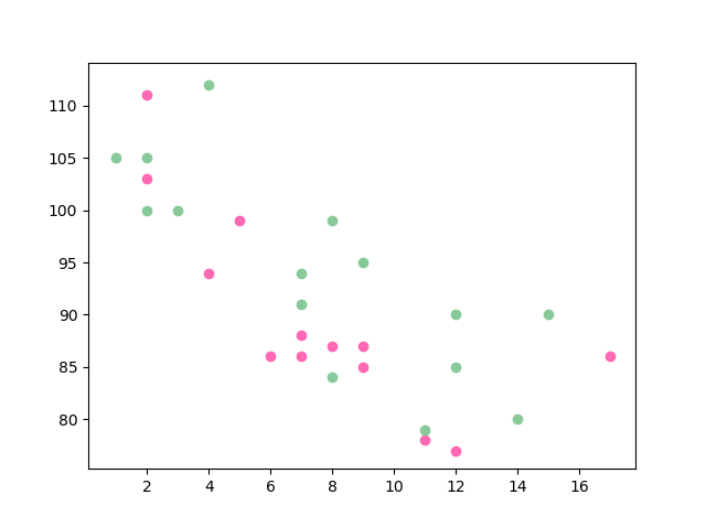
颜色
您可以使用 color 或 c 参数为每个散点图设置自己的颜色。
示例
设置标记的自定义颜色
import matplotlib.pyplot as plt
import numpy as np
x = np.array([5,7,8,7,2,17,2,9,4,11,12,9,6])
y = np.array([99,86,87,88,111,86,103,87,94,78,77,85,86])
plt.scatter(x, y, color = 'hotpink')
x = np.array([2,2,8,1,15,8,12,9,7,3,11,4,7,14,12])
y = np.array([100,105,84,105,90,99,90,95,94,100,79,112,91,80,85])
plt.scatter(x, y, color = '#88c999')
plt.show()
结果
为每个点着色
您还可以通过将颜色数组用作 c 参数的值来为每个点设置特定的颜色。
注意:对于此操作,您不能使用 color 参数,只能使用 c 参数。
示例
设置标记的自定义颜色
import matplotlib.pyplot as plt
import numpy as np
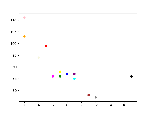
x = np.array([5,7,8,7,2,17,2,9,4,11,12,9,6])
y = np.array([99,86,87,88,111,86,103,87,94,78,77,85,86])
colors = np.array(["red","green","blue","yellow","pink","black","orange","purple","beige","brown","gray","cyan","magenta"])
plt.scatter(x, y, c=colors)
plt.show()
结果
颜色映射
Matplotlib 模块有许多可用的颜色映射。
颜色映射就像一个颜色列表,其中每种颜色都有一个从 0 到 100 的值。
这是一个颜色映射的示例

此颜色映射称为“viridis”,正如您所见,它从 0(紫色)到 100(黄色)不等。
如何使用颜色映射
您可以使用关键字参数 cmap 并指定颜色映射的名称来设置颜色映射,在本例中为 'viridis',这是 Matplotlib 中可用的内置颜色映射之一。
此外,您需要创建一个包含值(从 0 到 100)的数组,为散点图中的每个点分配一个值。
示例
创建一个颜色数组,并在散点图中指定颜色映射
import matplotlib.pyplot as plt
import numpy as np
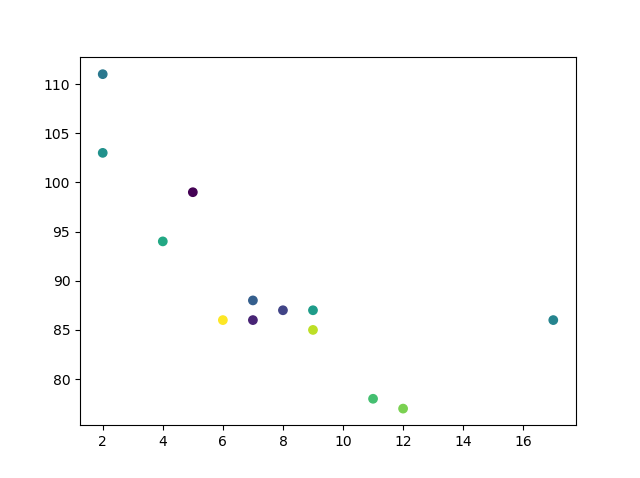
x = np.array([5,7,8,7,2,17,2,9,4,11,12,9,6])
y = np.array([99,86,87,88,111,86,103,87,94,78,77,85,86])
colors = np.array([0, 10, 20, 30, 40, 45, 50, 55, 60, 70, 80, 90, 100])
plt.scatter(x, y, c=colors, cmap='viridis')
plt.show()
结果
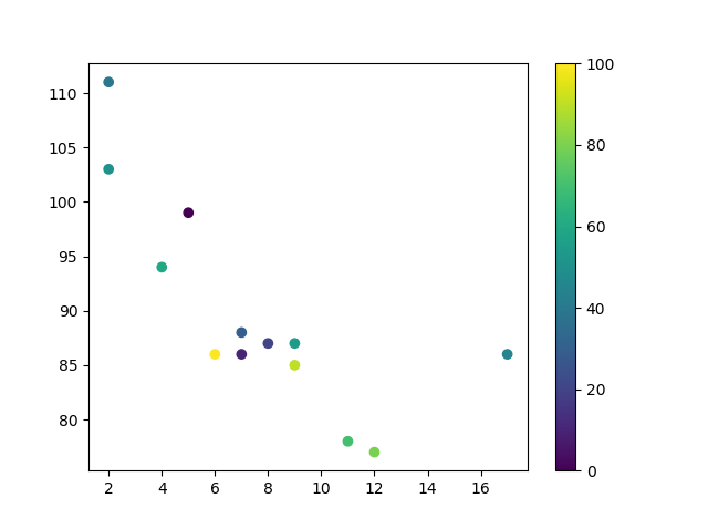
您可以通过包含 plt.colorbar() 语句来在绘图中包含颜色映射。
示例
包含实际的颜色映射
import matplotlib.pyplot as plt
import numpy as np
x = np.array([5,7,8,7,2,17,2,9,4,11,12,9,6])
y = np.array([99,86,87,88,111,86,103,87,94,78,77,85,86])
colors = np.array([0, 10, 20, 30, 40, 45, 50, 55, 60, 70, 80, 90, 100])
plt.scatter(x, y, c=colors, cmap='viridis')
plt.colorbar()
plt.show()
结果
可用的颜色映射
您可以选择任何内置的颜色映射。
| 名称 | Reverse | |||
|---|---|---|---|---|
| Accent | 试一试 » | Accent_r | 试一试 » | |
| Blues | 试一试 » | Blues_r | 试一试 » | |
| BrBG | 试一试 » | BrBG_r | 试一试 » | |
| BuGn | 试一试 » | BuGn_r | 试一试 » | |
| BuPu | 试一试 » | BuPu_r | 试一试 » | |
| CMRmap | 试一试 » | CMRmap_r | 试一试 » | |
| Dark2 | 试一试 » | Dark2_r | 试一试 » | |
| GnBu | 试一试 » | GnBu_r | 试一试 » | |
| Greens | 试一试 » | Greens_r | 试一试 » | |
| Greys | 试一试 » | Greys_r | 试一试 » | |
| OrRd | 试一试 » | OrRd_r | 试一试 » | |
| Oranges | 试一试 » | Oranges_r | 试一试 » | |
| PRGn | 试一试 » | PRGn_r | 试一试 » | |
| Paired | 试一试 » | Paired_r | 试一试 » | |
| Pastel1 | 试一试 » | Pastel1_r | 试一试 » | |
| Pastel2 | 试一试 » | Pastel2_r | 试一试 » | |
| PiYG | 试一试 » | PiYG_r | 试一试 » | |
| PuBu | 试一试 » | PuBu_r | 试一试 » | |
| PuBuGn | 试一试 » | PuBuGn_r | 试一试 » | |
| PuOr | 试一试 » | PuOr_r | 试一试 » | |
| PuRd | 试一试 » | PuRd_r | 试一试 » | |
| Purples | 试一试 » | Purples_r | 试一试 » | |
| RdBu | 试一试 » | RdBu_r | 试一试 » | |
| RdGy | 试一试 » | RdGy_r | 试一试 » | |
| RdPu | 试一试 » | RdPu_r | 试一试 » | |
| RdYlBu | 试一试 » | RdYlBu_r | 试一试 » | |
| RdYlGn | 试一试 » | RdYlGn_r | 试一试 » | |
| Reds | 试一试 » | Reds_r | 试一试 » | |
| Set1 | 试一试 » | Set1_r | 试一试 » | |
| Set2 | 试一试 » | Set2_r | 试一试 » | |
| Set3 | 试一试 » | Set3_r | 试一试 » | |
| Spectral | 试一试 » | Spectral_r | 试一试 » | |
| Wistia | 试一试 » | Wistia_r | 试一试 » | |
| YlGn | 试一试 » | YlGn_r | 试一试 » | |
| YlGnBu | 试一试 » | YlGnBu_r | 试一试 » | |
| YlOrBr | 试一试 » | YlOrBr_r | 试一试 » | |
| YlOrRd | 试一试 » | YlOrRd_r | 试一试 » | |
| afmhot | 试一试 » | afmhot_r | 试一试 » | |
| autumn | 试一试 » | autumn_r | 试一试 » | |
| binary | 试一试 » | binary_r | 试一试 » | |
| bone | 试一试 » | bone_r | 试一试 » | |
| brg | 试一试 » | brg_r | 试一试 » | |
| bwr | 试一试 » | bwr_r | 试一试 » | |
| cividis | 试一试 » | cividis_r | 试一试 » | |
| cool | 试一试 » | cool_r | 试一试 » | |
| coolwarm | 试一试 » | coolwarm_r | 试一试 » | |
| copper | 试一试 » | copper_r | 试一试 » | |
| cubehelix | 试一试 » | cubehelix_r | 试一试 » | |
| 旗帜 | 试一试 » | flag_r | 试一试 » | |
| gist_earth | 试一试 » | gist_earth_r | 试一试 » | |
| gist_gray | 试一试 » | gist_gray_r | 试一试 » | |
| gist_heat | 试一试 » | gist_heat_r | 试一试 » | |
| gist_ncar | 试一试 » | gist_ncar_r | 试一试 » | |
| gist_rainbow | 试一试 » | gist_rainbow_r | 试一试 » | |
| gist_stern | 试一试 » | gist_stern_r | 试一试 » | |
| gist_yarg | 试一试 » | gist_yarg_r | 试一试 » | |
| gnuplot | 试一试 » | gnuplot_r | 试一试 » | |
| gnuplot2 | 试一试 » | gnuplot2_r | 试一试 » | |
| gray | 试一试 » | gray_r | 试一试 » | |
| hot | 试一试 » | hot_r | 试一试 » | |
| hsv | 试一试 » | hsv_r | 试一试 » | |
| inferno | 试一试 » | inferno_r | 试一试 » | |
| jet | 试一试 » | jet_r | 试一试 » | |
| magma | 试一试 » | magma_r | 试一试 » | |
| nipy_spectral | 试一试 » | nipy_spectral_r | 试一试 » | |
| ocean | 试一试 » | ocean_r | 试一试 » | |
| pink | 试一试 » | pink_r | 试一试 » | |
| plasma | 试一试 » | plasma_r | 试一试 » | |
| prism | 试一试 » | prism_r | 试一试 » | |
| rainbow | 试一试 » | rainbow_r | 试一试 » | |
| seismic | 试一试 » | seismic_r | 试一试 » | |
| spring | 试一试 » | spring_r | 试一试 » | |
| summer | 试一试 » | summer_r | 试一试 » | |
| tab10 | 试一试 » | tab10_r | 试一试 » | |
| tab20 | 试一试 » | tab20_r | 试一试 » | |
| tab20b | 试一试 » | tab20b_r | 试一试 » | |
| tab20c | 试一试 » | tab20c_r | 试一试 » | |
| 地形 | 试一试 » | terrain_r | 试一试 » | |
| twilight | 试一试 » | twilight_r | 试一试 » | |
| twilight_shifted | 试一试 » | twilight_shifted_r | 试一试 » | |
| viridis | 试一试 » | viridis_r | 试一试 » | |
| winter | 试一试 » | winter_r | 试一试 » |
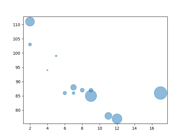
大小
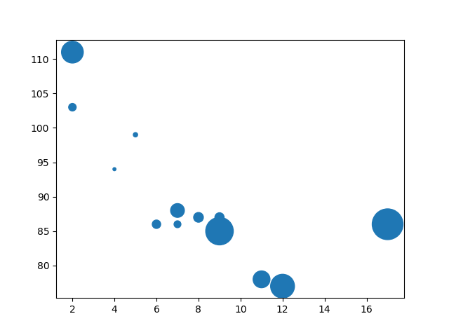
您可以使用 s 参数更改点的大小。
与颜色类似,请确保用于大小的数组与 x 轴和 y 轴的数组长度相同。
示例
设置标记的自定义大小
import matplotlib.pyplot as plt
import numpy as np
x = np.array([5,7,8,7,2,17,2,9,4,11,12,9,6])
y = np.array([99,86,87,88,111,86,103,87,94,78,77,85,86])
sizes = np.array([20,50,100,200,500,1000,60,90,10,300,600,800,75])
plt.scatter(x, y, s=sizes)
plt.show()
结果
透明度
您可以使用 alpha 参数调整点的透明度。
与颜色类似,请确保用于大小的数组与 x 轴和 y 轴的数组长度相同。
示例
设置标记的自定义大小
import matplotlib.pyplot as plt
import numpy as np
x = np.array([5,7,8,7,2,17,2,9,4,11,12,9,6])
y = np.array([99,86,87,88,111,86,103,87,94,78,77,85,86])
sizes = np.array([20,50,100,200,500,1000,60,90,10,300,600,800,75])
plt.scatter(x, y, s=sizes, alpha=0.5)
plt.show()
结果
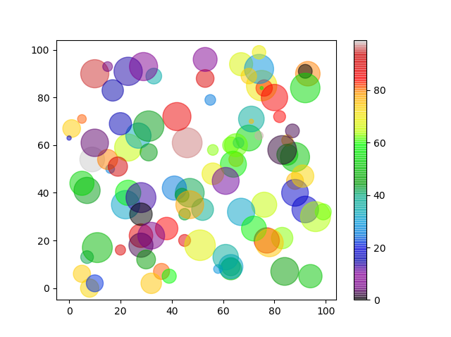
结合颜色、大小和透明度
您可以结合使用颜色映射和不同大小的点。如果点的透明度很高,这将可视化效果最好。
示例
创建包含 100 个 x 点、y 点、颜色和大小值的随机数组
import matplotlib.pyplot as plt
import numpy as np
x = np.random.randint(100, size=(100))
y = np.random.randint(100, size=(100))
colors = np.random.randint(100, size=(100))
sizes = 10 * np.random.randint(100, size=(100))
plt.scatter(x, y, c=colors, s=sizes, alpha=0.5, cmap='nipy_spectral')
plt.colorbar()
plt.show()
结果