Matplotlib 标签和标题
创建图表的标签
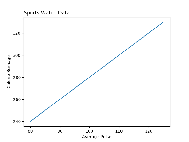
使用 Pyplot,你可以使用 xlabel() 和 ylabel() 函数来设置 x 轴和 y 轴的标签。
示例
为 x 轴和 y 轴添加标签
import numpy as np
import matplotlib.pyplot as plt
x = np.array([80, 85, 90, 95, 100, 105, 110, 115, 120, 125])
y = np.array([240, 250, 260, 270, 280, 290, 300, 310, 320, 330])
plt.plot(x, y)
plt.xlabel("平均脉搏")
plt.ylabel("消耗卡路里")
plt.show()
结果
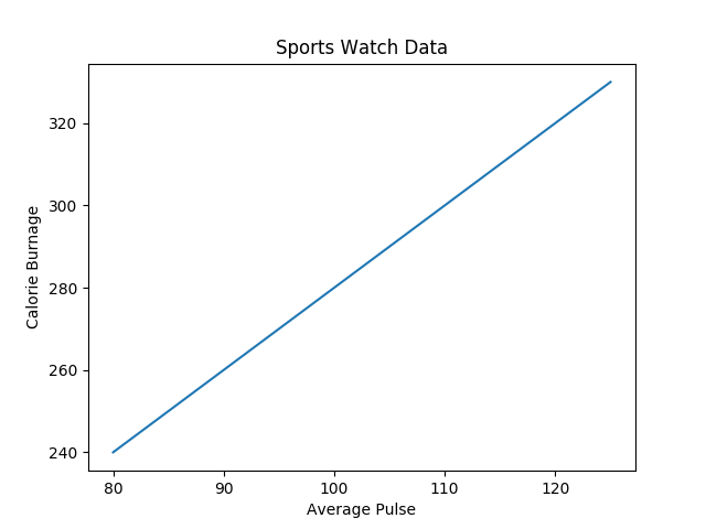
为图表创建标题
使用 Pyplot,你可以使用 title() 函数来设置图表的标题。
示例
添加图表标题以及 x 轴和 y 轴的标签
import numpy as np
import matplotlib.pyplot as plt
x = np.array([80, 85, 90, 95, 100, 105, 110, 115, 120, 125])
y = np.array([240, 250, 260, 270, 280, 290, 300, 310, 320, 330])
plt.plot(x, y)
plt.title("运动手表数据")
plt.xlabel("平均脉搏")
plt.ylabel("消耗卡路里")
plt.show()
结果
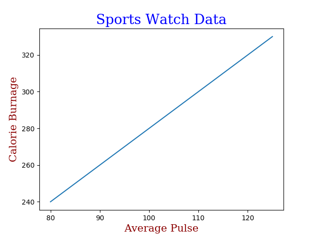
设置标题和标签的字体属性
你可以使用 xlabel()、ylabel() 和 title() 中的 fontdict 参数来设置标题和标签的字体属性。
示例
设置标题和标签的字体属性
import numpy as np
import matplotlib.pyplot as plt
x = np.array([80, 85, 90, 95, 100, 105, 110, 115, 120, 125])
y = np.array([240, 250, 260, 270, 280, 290, 300, 310, 320, 330])
font1 = {'family':'serif','color':'blue','size':20}
font2 = {'family':'serif','color':'darkred','size':15}
plt.title("运动手表数据", fontdict = font1)
plt.xlabel("平均脉搏", fontdict = font2)
plt.ylabel("消耗卡路里", fontdict = font2)
plt.plot(x, y)
plt.show()
结果
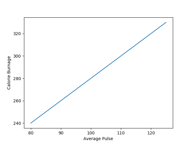
定位标题
你可以使用 title() 中的 loc 参数来定位标题。
合法值是:'left'(左)、'right'(右)和 'center'(居中)。默认值为 'center'。
示例
将标题定位在左侧
import numpy as np
import matplotlib.pyplot as plt
x = np.array([80, 85, 90, 95, 100, 105, 110, 115, 120, 125])
y = np.array([240, 250, 260, 270, 280, 290, 300, 310, 320, 330])
plt.title("运动手表数据", loc = 'left')
plt.xlabel("平均脉搏")
plt.ylabel("消耗卡路里")
plt.plot(x, y)
plt.show()
结果