数据科学 - 线性回归
我们遗漏了一个影响 Calorie_Burnage 的重要变量,那就是训练课程的 Duration(时长)。
Duration(时长)与 Average_Pulse(平均脉搏)结合起来,将能更精确地解释 Calorie_Burnage(消耗的卡路里)。
线性回归
当你试图找出变量之间的关系时,就会用到 regression(回归)这个术语。
在机器学习和统计建模中,这种关系被用来预测事件的结果。
在本模块中,我们将介绍以下问题:
- 我们能否得出结论:Average_Pulse(平均脉搏)和 Duration(时长)与 Calorie_Burnage(消耗的卡路里)相关?
- 我们能否利用 Average_Pulse(平均脉搏)和 Duration(时长)来预测 Calorie_Burnage(消耗的卡路里)?
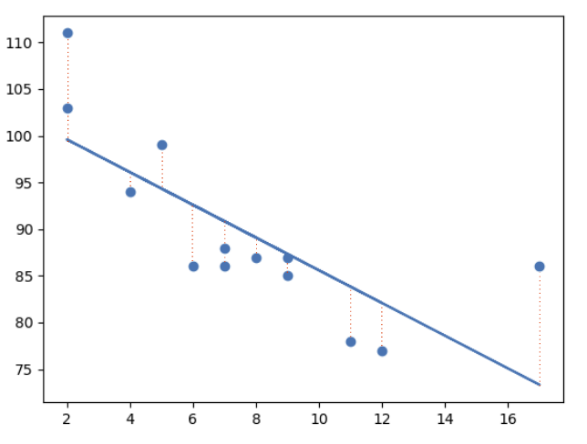
最小二乘法
线性回归使用最小二乘法。
其概念是绘制一条穿过所有散点图数据点的直线。这条直线的位置是为了最小化所有数据点到直线的距离。
这个距离被称为“残差”或“误差”。
红色的虚线表示数据点到绘制的数学函数的距离。
单解释变量线性回归
在此示例中,我们将尝试使用线性回归来通过 Average_Pulse(平均脉搏)预测 Calorie_Burnage(消耗的卡路里)。
示例
import pandas as pd
import matplotlib.pyplot as plt
from scipy import stats
full_health_data = pd.read_csv("data.csv", header=0, sep=",")
x = full_health_data["Average_Pulse"]
y = full_health_data ["Calorie_Burnage"]
slope, intercept, r, p, std_err = stats.linregress(x, y)
def myfunc(x)
return slope * x + intercept
mymodel = list(map(myfunc, x))
plt.scatter(x, y)
plt.plot(x, slope * x + intercept)
plt.ylim(ymin=0, ymax=2000)
plt.xlim(xmin=0, xmax=200)
plt.xlabel("Average_Pulse")
plt.ylabel ("Calorie_Burnage")
plt.show()
自己动手试一试 »
示例解释
- 导入所需的模块:Pandas、matplotlib 和 Scipy
- 将 Average_Pulse(平均脉搏)隔离为 x。将 Calorie_burnage(消耗的卡路里)隔离为 y。
- 使用:slope, intercept, r, p, std_err = stats.linregress(x, y) 获取重要的关键值。
- 创建一个函数,该函数使用斜率 (slope) 和截距 (intercept) 值来返回一个新值。这个新值代表了对应 x 值在 y 轴上的位置。
- 将 x 数组的每个值通过函数运行。这将产生一个包含新的 y 轴值的数组:mymodel = list(map(myfunc, x))
- 绘制原始散点图:plt.scatter(x, y)
- 绘制线性回归线:plt.plot(x, mymodel)
- 定义坐标轴的最大值和最小值。
- 标注坐标轴:“Average_Pulse”(平均脉搏)和“Calorie_Burnage”(消耗的卡路里)。
输出
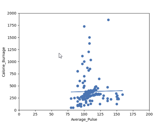
您认为这条线能够精确地预测 Calorie_Burnage(消耗的卡路里)吗?
我们将证明,仅凭 Average_Pulse(平均脉搏)变量不足以精确预测 Calorie_Burnage(消耗的卡路里)。