什么是 Bootstrap?

Bootstrap 是最流行的 CSS 框架,用于开发响应式和移动优先的网站。
Bootstrap 5 是 Bootstrap 的最新版本
Bootstrap 快速入门
示例
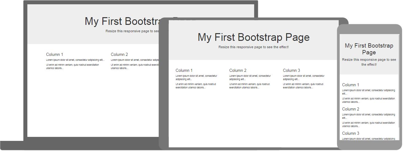
<div class="bg-primary text-white p-5 text-center">
<h1>我的第一个 Bootstrap 页面</h1>
<p>调整此页面大小以查看响应式效果!</p>
</div>
<div class="container-fluid">
<div class="row">
<div class="col-sm-4">
<h2>London</h2>
<p>London is the capital city of England.</p>
<p>It is the most populous city in the United Kingdom,
with a metropolitan area of over 13 million inhabitants.</p>
</div>
<div class="col-sm-4">
<h2>Paris</h2>
<p>Paris is the capital of France.</p>
<p>The Paris area is one of the largest population centers in Europe,
with more than 12 million inhabitants.</p>
</div>
<div class="col-sm-4">
<h2>Tokyo</h2>
<p>Tokyo is the capital of Japan.</p>
<p>It is the center of the Greater Tokyo Area,
and the most populous metropolitan area in the world.</p>
</div>
</div>
</div>
自己动手试一试 »单击“Try it Yourself”按钮查看其工作原理。
浏览器支持
Bootstrap 5 是 Bootstrap 的最新版本。
Bootstrap 5 支持所有主流浏览器,除了 Internet Explorer 11 及更早版本。
如果您需要支持 IE9 或 IE8,则必须使用 Bootstrap 3。
Bootstrap 容器
container 类是 Bootstrap 最重要的类之一。
它为 HTML 元素提供了边距、填充、对齐等功能。
示例
<div class="container">
<h1>This is a paragraph</h1>
<p>This is a paragraph</p>
<p>This is a paragraph</p>
<p>This is a paragraph</p>
<p>This is a paragraph</p>
</div>
自己动手试一试 »
Bootstrap 颜色
伦敦是英国人口最多的城市,都会区超过 900 万居民。
伦敦是英国人口最多的城市,都会区超过 900 万居民。
伦敦是英国人口最多的城市,都会区超过 900 万居民。
伦敦是英国人口最多的城市,都会区超过 900 万居民。
伦敦是英国人口最多的城市,都会区超过 900 万居民。
伦敦是英国人口最多的城市,都会区超过 900 万居民。
伦敦是英国人口最多的城市,都会区超过 900 万居民。
示例
<div class="container bg-primary text-white p-4">
<p>London is the most populous city in the United Kingdom, with a metropolitan area of over 9 million inhabitants.</p>
</div>
<div class="container bg-success text-white p-4">
<p>London is the most populous city in the United Kingdom, with a metropolitan area of over 9 million inhabitants.</p>
</div>
自己动手试一试 »
Bootstrap 文本颜色
此文本被设为灰色。
此文本很重要。
此文本表示成功。
此文本代表一些信息。
此文本代表警告。
此文本代表危险。
示例
<div class="container">
<p class="text-muted">This text is muted.</p>
<p class="text-primary">This text is important.</p>
<p class="text-success">This text indicates success.</p>
<p class="text-info">This text represents some information.</p>
<p class="text-warning">This text represents a warning.</p>
<p class="text-danger">This text represents danger.</p>
</div>
自己动手试一试 »
Bootstrap 列
所有设备和屏幕宽度上的三个等宽列
示例
<div class="row">
<div class="col">.col</div>
<div class="col">.col</div>
<div class="col">.col</div>
</div>
自己动手试一试 »
响应式列
三个等宽列,在小屏幕上堆叠在彼此之上
示例
<div class="row">
<div class="col-sm-4">.col-sm-4</div>
<div class="col-sm-4">.col-sm-4</div>
<div class="col-sm-4">.col-sm-4</div>
</div>
自己动手试一试 »
Bootstrap 表格
一个带边框的斑马条纹表
| 名 | 姓 | 邮箱 |
|---|---|---|
| John | Doe | john@example.com |
| Mary | Moe | mary@example.com |
| July | Dooley | july@example.com |
示例
<table class="table table-striped table-bordered">
<thead>
<tr>
<th>Firstname</th>
<th>Lastname</th>
<th>Email</th>
</tr>
</thead>
<tbody>
<tr>
<td>John</td>
<td>Doe</td>
<td>john@example.com</td>
</tr>
<tr>
<td>Mary</td>
<td>Moe</td>
<td>mary@example.com</td>
</tr>
<tr>
<td>July</td>
<td>Dooley</td>
<td>july@example.com</td>
</tr>
</tbody>
</table>
自己动手试一试 »
Bootstrap 警告
Bootstrap 提供了一种简单的方法来创建预定义的警告消息
Success! This alert box indicates a successful or positive action.
Warning! This alert box indicates a warning that might need attention.
Danger! This alert box indicates a dangerous or potentially negative action.
Primary! This alert box indicates an important action.
示例
<div class="alert alert-success">
<strong>Success!</strong> Indicates a successful or positive action.
</div>
自己动手试一试 »
Bootstrap 按钮
Bootstrap 提供不同风格的按钮
示例
<button type="button" class="btn">Basic</button>
<button type="button" class="btn btn-primary">Primary</button>
<button type="button" class="btn btn-secondary">Secondary</button>
<button type="button" class="btn btn-success">Success</button>
<button type="button" class="btn btn-info">Info</button>
<button type="button" class="btn btn-warning">Warning</button>
<button type="button" class="btn btn-danger">Danger</button>
<button type="button" class="btn btn-dark">Dark</button>
自己动手试一试 »
Bootstrap 卡片
示例
<div class="card" style="width:400px">
<img src="img_avatar1.png" alt="Card image">
<div class="card-body">
<h4 class="card-title">John Doe</h4>
<p class="card-text">一些示例文本。</p>
<a href="#" class="btn btn-primary">查看个人资料</a>
</div>
</div>
自己动手试一试 »
完整的 Bootstrap 教程
这是对 Bootstrap 的简短描述。
要获取完整的 Bootstrap 5 教程,请访问 W3Schools Bootstrap 5 教程。